Member-only story
A Perfect Square with CSS
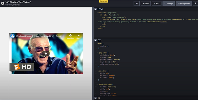
Make a perfect square with CSS that fluidly adjusts to the width of its container. Thanks Dave Rupert for this trick.

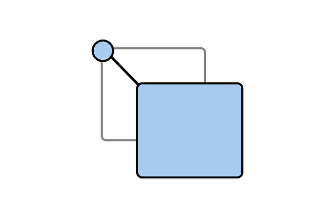
Step 1: Add an empty DIV tag
There’s only one line of HTML for this project. It’s an empty DIV tag.
<div></div>Now, let’s add a class that we can target. The class you use is only limited by your imagination! However, I recommend using something simple and descriptive like class=”square”.
<div class="square"></div>Step 2: Style the DIV so its height is equal to its width
Style the .square to have a width of 100%, a height of 0 and set the top padding to 100%.
.square {
  width: 100%;
  height: 0;
  padding-top: 100%;
}
If you want to see your square you can add a background color or border.
Edit from @jameel_51660 via the comments: If you want to add a border you can use box-sizing: border-box so that the border you add doesn’t add to the overall height and width of the square.
.square {
  width: 100%;
  height: 0;
  padding-top: 100%;
  background-color: #ccc;
}
That’s it! You have a perfect square that will fit inside of any container you place it in. Read on if you want to know why this works or how to add content inside of the square.
Why Does This Work?
A square is a two-dimensional shape with a height equal to its width. So, couldn’t we just pick a height and width and set it using CSS?
.square {
  height: 500px;
  width: 500px;
}
That works great until you try to resize your browser. If the browser is less than 500px wide, your square will be wider than the viewport width. That’s not what we want for our users on narrow phones. Also, what about our friends using mega-ultra-wide screens? Isn’t a 500px square going to display pretty small?
Okay, so we don’t just need a square. We need a square that will keep its “squareness” while resizing perfectly with the width of its container. This is called making our square’s width fluid.


